Image Histograms and Contrast
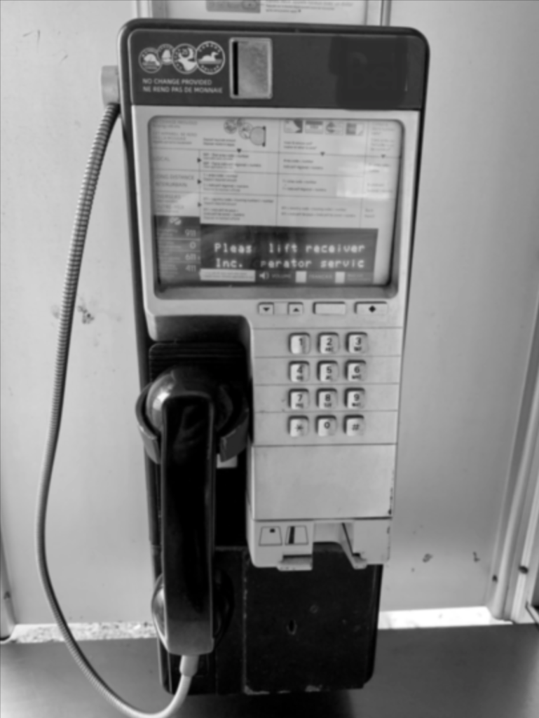
Today we will be talking about image histograms and contrast. In the past, we’ve talked about how to generate Histograms and visualizations in Python. Subsequently, we want to talk about histograms of an image. As an illustration, we take a black and white photo and look at one important property; the intensity of the pixel.

Obviously we see pixels in different shades of grey; often ranging from 0 to 255. If we were to count the number of pixels with intensity 0, 1, 2,… 255, then we would be able to plot a histogram with bin size 1.
Getting Started – Image Histograms and Contrast
In the same fashion as we did in the past, let us start off with importing our necessary libraries and setting up a helper function to display images in a Jupyter notebook. Accordingly, we import OpenCV and Numpy first.
import cv2
import numpy as np

#The line below is necessary to show Matplotlib's plots inside a Jupyter Notebook
%matplotlib inline
from matplotlib import pyplot as plt

#Use this helper function if you are working in Jupyter Lab
#If not, then directly use cv2.imshow(<window name>, <image>)

def showimage(myimage):
    if (myimage.ndim>2):  #This only applies to RGB or RGBA images (e.g. not to Black and White images)
        myimage = myimage[:,:,::-1] #OpenCV follows BGR order, while matplotlib likely follows RGB order

    fig, ax = plt.subplots(figsize=[10,10])
    ax.imshow(myimage, cmap = 'gray', interpolation = 'bicubic')
    plt.xticks([]), plt.yticks([])  # to hide tick values on X and Y axis
    plt.show()
Once we have our pre-requisites, we further read in our desired image. For example, to import our image of our phone, we would run the following code:
# Read in our image as Grayscale
Phone = cv2.imread("Phone.jpg")
Phone_grey = cv2.cvtColor(Phone, cv2.COLOR_BGR2GRAY)
showimage(Phone_grey)  #This displays our image
Now that we have our grayscale image, we could use Numpy’s built in histogram function to display the intensity of each shade of grey [0,256].
# Using Numpy Histogram function, we determine the number of pixels with intensity
# between 0..255.
Phone_hist, Phone_bin = np.histogram(Phone_grey,256,[0,256])
print(Phone_hist)
[62159 32142 20571 16777 15704 14238 13971 14202 14055 14297 14733 14538
 14563 14494 14456 14220 13772 12991 12127 11354 10221  9051  8294  7374
  6713  6078  5549  5254  4902  4740  4761  4649  4758  4739  4701  4897
  4924  5080  5141  5271  5298  5278  5161  5202  5197 16679 25682 10031
  6859  6515  6839  7303  8077  9176 10610 11832 12597 12931 13121 12800
 12104 10932 10595 10194 10332 10057 10228 10078 10487 10744 11106 11512
 11978 12220 11552 10690  9754  8949  8408  7605  6761  6064  5334  4873
  4509  4329  4114  4100  4178  4214  4264  4237  4447  4334  4507  4768
  4943  5143  5229  5511  5662  5997  6400  6537  7249  7390  7328  7269
  7457  7125  7114  6976  7105  7237  7167  7352  7285  7700  8078  7664
  7567  7409  7513  7387  7738  8348  8634  9848 10887 11282 11562 11457
 11563 12403 14251 15410 15373 14759 14888 14641 14158 15741 16402 17411
 17613 17418 18261 17902 19599 20042 20596 20315 20794 20784 21351 20427
 20334 20155 21208 22038 22842 25040 28708 28866 28154 28950 30275 30831
 31348 31191 31352 32489 34578 36821 36320 35080 33622 30535 31602 30730
 30439 31084 31260 34045 34494 30445 26415 24507 23420 22475 23980 25397
 23930 23657 25491 27739 27148 28581 27827 29206 32001 30511 32834 34835
 40346 40781 35353 28588 24932 23584 16178  9350  4951  3648  2861  2530
  2420  2048  1938  1794  1760  1699  1512  1441  1205  1148  1082  1080
  1065  1093   931   942   851   821   755   828   811   859   868   848
   778   684   630   572   512   479   499   486   541   616   719   813
  1140  2279  5795  4407]
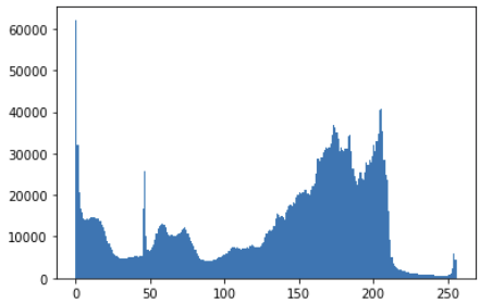
As shown above, we see many pixels that fall within the range of [0,20] (the first two rows of our output). These likely represent the handset of the pay phone as well as the bottom half as they are mainly black. Additionally, we can also find a high number of pixels in the second half of the table. Evidently, these are the lighter gray pixels that make up the general background. Lastly, we observe not many pixels are in the last two rows, meaning there are not a lot of white pixels.
At this point, we can also plot the histogram using matplotlib to visually represent our image pixel intensity.
plt.hist(Phone_grey.ravel(), 256,[0,256])
plt.show()

Enhancing Contrast by Histogram Equalization
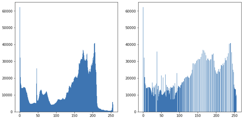
A common means to enhance contrast of an image is by equalizing the intensity across the entire range {0,256]. Furthermore, spreading out the intensity allows the largest possible contrast between the pixels. For that reason, OpenCV provides a histogram equalization function that helps us achieve this with only a few lines of code.
# Using OpenCV's built in equalizeHist function, we could easily equalize the image
# intensity by passing in our greyscale image
Phone_e = cv2.equalizeHist(Phone_grey)
We then plot the histogram to show how the effects of the equalization. If you don’t recall how this can be done, we recommend checking our earlier post on Data Visualizations with MatPlotLib. In short, with a few lines of code, we can plot the two histograms.
# With Matplotlib, we now plot the two histograms side by side for comparison
# This illustrates how the histogram looks like after equalization

fig, ax = plt.subplots(ncols=2, figsize=(12,6))
ax[0].hist(Phone_grey.ravel(), 256,[0,256])
ax[1].hist(Phone_e.ravel(),256,[0,256])
plt.show()

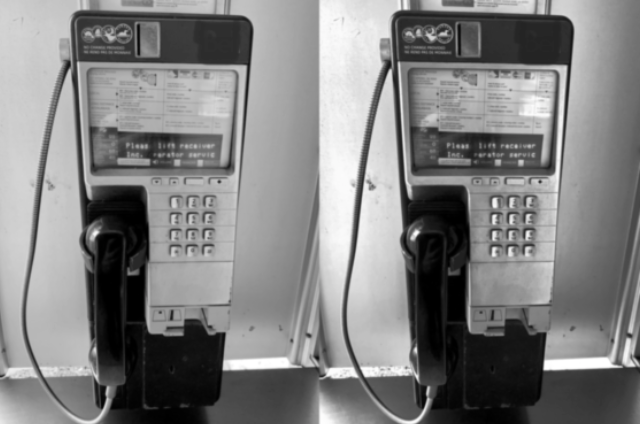
Finally we want to display our image before and after contrast equalization took place.
# Using Numpy's function to append the two images horizontally
side_by_side = np.hstack((Phone_grey,Phone_e))

showimage(side_by_side)

Unquestionably, the contrast of the image on the right has been improved. For instance, notice how the number pad or some of the text at the top has a clearer distinction. Furthermore the cable connecting the ear piece on the left also has greatly improved contrast against its background.


