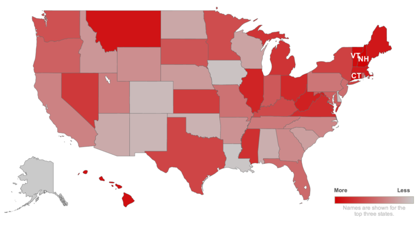
Visualizing Data on Maps
Visualizing Data on Maps is a very effective and impactful way to display your data. If you’ve ever followed a major US election, then you know that major news outlets such as CNN or MSNBC often use this technique. Basically as election results come in, the results are displayed on a map that turns to a shade of red or to a shade of blue. At this point the viewer can quickly see whether one party is leading and which one. Evidently this is a powerful way to convey data in an easy to understand way. By comparison if the results were shown to you in a table format, you need to compare numbers to know whose leading.
Therefore today we would like to show how this can easily be done with only a few lines of code. Instead of using election data, we will use COVID-19 Restriction Violations in York Region of Ontario Canada found on Kaggle
Data preparation
Whether you want to visualize data on maps during your exploratory data analysis (EDA) or as a means to display your analysis results, everything starts with data preparation. As a result, we encourage you to check out our other articles about reading in data, then further getting familiar with data, and finally some tips to clean data types.
import pandas as pd
import numpy as np
import folium  #<--- This library helps us plot data on maps
from folium.plugins import MarkerCluster

#Convert your data into necessary Data Types
covid = pd.read_csv("../COVID19-TO/COVID19-Charges-Clean.csv")

covid.LAT=covid.LAT.astype("float64")
covid.LON=covid.LON.astype("float64")

covid.head()
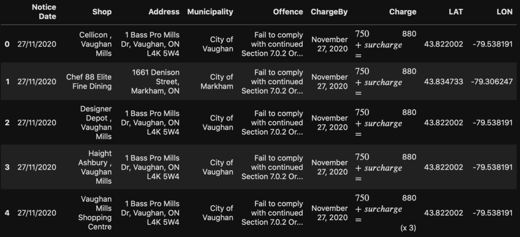
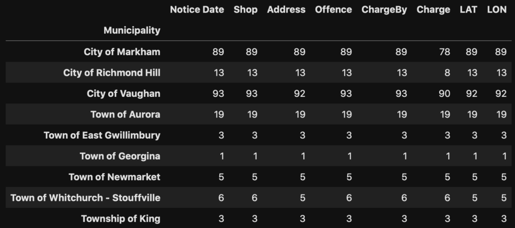
Furthermore we do a quick groupby to get a good overview of which Municipalities had the most violations.
#Useful way to quickly create a grouping/pivot table like summary
covid.groupby(by='Municipality').count()
Meanwhile you may notice we have two columns in our dataset called LAT and LON. Both LAT and LON correspond to the GPS coordinates of each violation. Furthermore we can determine the center of all the COVID-19 violations by taking the average of the Latitude and Longitude.
print(covid.LAT.mean(), covid.LON.mean())
43.85746758260869 -79.43319286956522Visualizing Data on Maps with Marker
In order to visualize our data, we will begin with displaying a map over the York region. Subsequently we will be adding markers on our map to show where the violations occurred.
# Create a map centered on LOCATION, with a ZOOM_START level of 10
GTA = folium.Map(location=[covid.LAT.mean(), covid.LON.mean()], zoom_start=10)
As shown above, we will create a folium.map object called GTA. The location parameter tells us where to center our map. Furthermore the zoom_start parameter tells us how close to zoom into our map. At this point we can begin adding markers to our map. Basically we will loop through our dataset and add a folium.Marker onto our map. We provide the GPS coordinates of each violation, and in the popup parameter give it the name of the shop. Additionally we will skip any violations marked as “Residence”.
# Add Markers of Covid violations
for i in range(0,covid.shape[0],1):
    if covid.Shop[i] != "Residence":
        folium.Marker([covid.LAT[i], covid.LON[i]], popup=covid.Shop[i]).add_to(GTA)

# To display our map, simply call our object
GTA
As shown above the map can be interactive by moving around and zooming in. Furthermore when you click on the markers, the name of the shop will be displayed. Finally if you want to save your map to send this to others, you can issue the below command.
# To save our map as HTML
GTA.save("GTA_Marker.html")
Visualizing Data on Maps with Marker Cluster
Up to the present time we have created our first map and you may see there are many markers. Undoubtedly with too many markers it becomes very difficult to visualize the data. Therefore we will improve our map by introducing Marker Cluster. A Marker Cluster will still allows you to add points of interest on your map. Additionally they provide the added ability to group markers based on the zoom level. In other words as you zoom out of the map, markers start to consolidate and are replaced by a number indicating how many markers it represents.
In order to achieve this, we start off once again by creating a blank map
GTA = folium.Map(location=[covid.LAT.mean(), covid.LON.mean()], zoom_start=10)
Next we are going to create several Marker Clusters, one representing each Municipality in York Region, ON. Additionally we will create a dictionary that will help us map the Municipality in our pandas dataframe to the corresponding Marker Cluster.
# Create our Marker Clusters
Vaughan = MarkerCluster(name="City of Vaughan", locations=[[-79.566373099976275, 43.834984875331209]]).add_to(GTA)
Markham = MarkerCluster(name="City of Markham", locations=[[-79.294985214488122, 43.885028037206304]]).add_to(GTA)
Aurora = MarkerCluster(name="Town of Aurora", locations=[[-79.456871977249122, 43.995928547946129]]).add_to(GTA)
RichmondHill = MarkerCluster(name="City of Richmond Hill", locations=[[-79.423940417178017, 43.878785760503462]]).add_to(GTA)
Gwillimbury = MarkerCluster(name="Town of East Gwillimbury", locations=[[-79.387213112272789, 44.145983089800367]]).add_to(GTA)
Newmarket = MarkerCluster(name="Town of Newmarket", locations=[[-79.460835347223721, 44.049758541257198]]).add_to(GTA)
King = MarkerCluster(name="Township of King", locations=[[-79.528168283758447, 43.928964221225392]]).add_to(GTA)
Stouffville = MarkerCluster(name="Town of Whitchurch - Stouffville", locations=[[-79.334540396317792, 44.000214968797522]]).add_to(GTA)
Georgina = MarkerCluster(name="Town of Georgina", locations=[[-79.397540430378584, 44.263693059245121]]).add_to(GTA)

# Create a dictionary mapping the Municipality to Marker Cluster
Municipality = {
    "City of Vaughan":Vaughan,
    "City of Markham":Markham,
    "Town of Aurora":Aurora,
    "City of Richmond Hill":RichmondHill,
    "Town of East Gwillimbury":Gwillimbury,
    "Town of Newmarket":Newmarket,
    "Township of King":King,
    "Town of Whitchurch - Stouffville":Stouffville,
    "Town of Georgina":Georgina
}
Once we have our Marker Clusters setup instead of adding our markers directly to our map, we will add them to the corresponding cluster marker.
# Add Clustered Markers
for i in range(0,covid.shape[0],1):
    if covid.Shop[i] != "Residence":
        folium.Marker([covid.LAT[i], covid.LON[i]], popup=covid.Shop[i]).add_to(Municipality[covid.Municipality[i]])
Finally we can plot our map again to see how it looks. Test it out by zooming and and out of the map to see how markers group together as the zoom level changes.
GTA
Visualizing Data on Choropleth Maps
Earlier in our introductions we mentioned about a typical election map showing voting results by color. In truth these are referred to as a Choropleth Map. In short, Choropleth Maps allows us to color defined regions of a map based on certain statistical value. Previously we introduced the fact that York Region is split into different municipalities. Hence we will show how to show the our COVID19 Restriction violation data on a Choropleth Map based on municipalities. As always, we start off by creating a blank map.
GTA = folium.Map(location=[covid.LAT.mean(), covid.LON.mean()], zoom_start=10)
GeoJSON – How we describe polygons on a map
Subsequently our next challenge is how do we draw on our map and how does the map know what are the boundaries of each municipality? Actually geographic borders can be electronically represented in various formats. In order to work with our folium library, we will need what is called a GeoJSON. Compared to a standard JSON, a GeoJSON contains specific information that can describe geometries and points on a map. Furthermore properties of a geographic area can also be stored such as population, area, etc. In general it is easer to search for online resources as often times GeoJSON files for the area you are interested are available for download. As in our case the York region data was available at the York Region Open Data portal. As an illustration, here is how a general GeoJSON would look like.
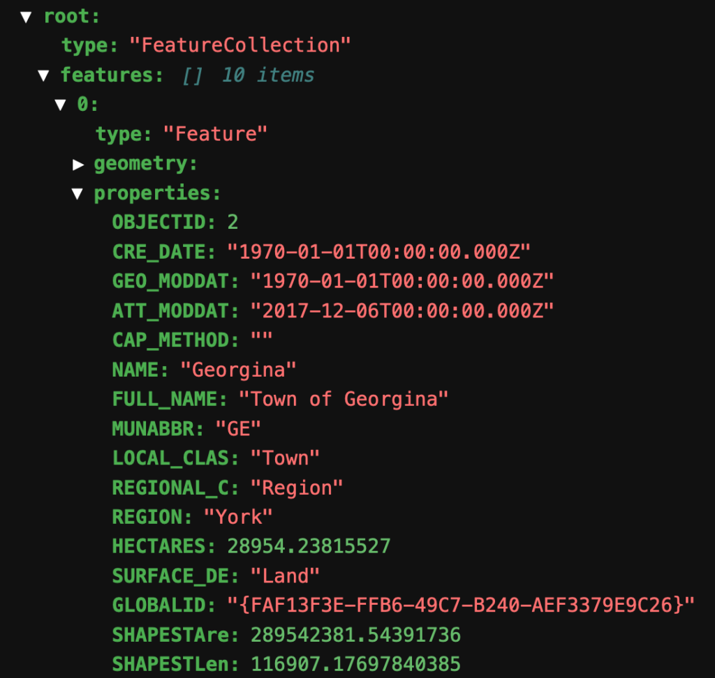
By and large the property we are most interested in is the geometry and the full name. Not only does the former contain GPS coordinates of the municipality boundaries, the latter allows us to link the geometry data to our pandas dataframe.
Using folium.Choropleth
Subsequently we will use the results from our GroupBy function as that matches up perfectly with our GeoJSON and allows us to know how many violations occurred in each municipality.
york_geo = "York.json"

#Need to create PD of [Municipality, Violation Count]
covid_m = covid.groupby(by='Municipality').count()
covid_m['Munic']=covid_m.index
covid_m
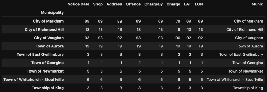
As soon as we have our data ready, the final step is to leverage folium.Choropleth function to create visualize our dataset. Generally most people have difficulties knowing what the correct value should be for the key_on field. First thing to remember here is that it is referring to our GeoJSON file, and as like all JSON they have a structure to them. As illustrated above, our GeoJSON file contained 10 items, and hence our key_on starts with “feature” (meaning one of the “features”). Following along this logic we therefore conclude that “feature.properties.FULL_NAME” will direct us to match against the first column described in the columns field (“Munic”).
folium.Choropleth(
    data=covid_m,
    columns=["Munic","Offence"],
    key_on='feature.properties.FULL_NAME',
    fill_opacity=0.5,
    line_opacity=0.5,
    geo_data=york_geo,
    fill_color='YlOrBr', # ‘BuGn’, ‘BuPu’, ‘GnBu’, ‘OrRd’, ‘PuBu’, ‘PuBuGn’, ‘PuRd’, ‘RdPu’, ‘YlGn’, ‘YlGnBu’, ‘YlOrBr’, and ‘YlOrRd’
    name='Choropleth',
    legend_name="Covid Restriction Violations",
).add_to(GTA) #Adds the choropleth object to our map

#Adds a Layer Control so we may opt to show or hide our Choropleth layer
folium.LayerControl().add_to(GTA)

GTA
On the whole we see that it is very simple and convenient to use folium.Choropleth. That is to say as long as you have the corresponding GeoJSON of the region you are interested in.
Visualizing Data on a Map – Choropleth Maps extended
Until now we have managed to make our first Choropleth map with our Covid dataset. Occasionally we may find that folium.Choropleth acts as a good start, but we would like to make more customizations. In this case we will show you two more features that will allow you to make stunning visualizations. In order to do so we will use two more additional libraries in our following section.
from folium.features import GeoJsonTooltip
import branca
import geopandas

GTA = folium.Map(location=[covid.LAT.mean(), covid.LON.mean()], zoom_start=10)
Custom Colormaps
Whenever we find the built in colormaps are insufficient or we would like more options in coloring our Choropleth map, we can also build a custom colormap. Whereas the example in our previous map showed a colormap ranging from pale yellow to brown, custom color maps allow more variety.
#Create a colormap with branca
colormap = branca.colormap.LinearColormap(
    vmin=covid_m.Offence.min(),  # min value
    vmax=covid_m.Offence.max(),   # max value
    colors=["green", "yellow","red"],  # list of colors to be used
    caption="Covid Restriction Violations",  # title of legend
)
Accordingly the code above will create a color map that looks like the following:

Displaying data with Mouse Over – GeoJsonTooltip
Instead of only displaying the number of violations through a color map, we can also add a Mouse Over function over our different municipalities. In turn this means whenever the audience moves their mouse over a municipality, further details about the region are displayed. To achieve this, we will use the GeoJsonTooltip function, defined as per below.
GTA_tooltip = GeoJsonTooltip(
    fields=['Munic','Offence'],  #which fields to display
    aliases=['Municipality:','Violations:'],  # We can rename the field names instead of using column headers
    localize=True,
    sticky=False,  # Does the information stay on screen
    labels=True,
    style="""
        background-color: #F0EFEF;
        border: 2px solid black;
        border-radius: 3px;
        box-shadow: 3px;
    """,
    max_width=400,
)
Before we can display our tooltip on our map we need to merge our covid dataset with the properties from our GeoJSON. Consequently we use the last new library today “geopandas”, that allows us to represent our GeoJSON in a pandas dataset like way.
# Read our JSON into geopandas

York = geopandas.read_file('York.json')
York.head()
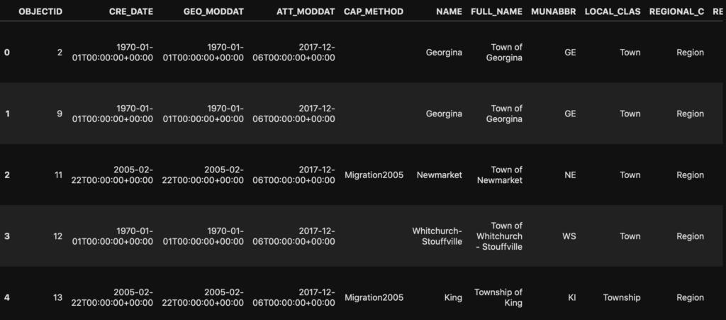
Bringing everything together – folium.GeoJson
By the same token as we cross referenced our GeoJSON with our original covid dataset, we will now use pandas.merge (analogous to database JOIN) to combine our geopandas with our covid dataset.
# We want to map covid_m.Offence to the geopandas York for further mapping
# The merge function is like VLOOKUP or DB JOIN
York=York.merge(. #This dataset is LEFT
    covid_m,  #This dataset is RIGHT
    how="left",
    left_on="FULL_NAME",
    right_on="Munic",
)
With our data prepared we are now ready to start creating our Choropleth map again. Different from before we will use the lower level folium.GeoJson function.
# Create folium.GeoJson

GTA_choro = folium.GeoJson(
    York,  # Geopandas
    style_function=lambda x: {  #Pass the Lambda function to map to colormap
        "fillColor": colormap(x['properties']["Offence"])  #traversing JSON like syntax normally was feature.properties.Offence
        if x['properties']["Offence"] is not None and x['properties']['SURFACE_DE'] == 'Land'  #Only color Land
        else "transparent", # Missing Values, or Water are mapped to Transparent
        "color": "black",
        "fillOpacity": 0.4,
    },
    tooltip=GTA_tooltip,
    name="Violations"
).add_to(GTA)
Compared to folium.Choropleth here we have more finer control on how the map is draw. For example in order to color our map we now pass a style_function that makes use of our custom color map. Furthermore we can control each individual shape on our map if we wanted to based on the lambda function. As an illustration, we excluded colouring any region considered bodies of water.
Finally we add our custom color map onto our map, and as before include a layer control
colormap.add_to(GTA)  #Add our colormap legend to the map
folium.LayerControl().add_to(GTA)  #Add a Layer Control so we can select to display Choropleth

GTA
Summary
In essence today we started our journey by plotting a chart and simply adding Markers to display the Covid19 restriction violations on York Region, ON, Canada. In order to make the visualization of numerous markers more appealing we also looked at how to use Marker Clusters. Finally we moved on to show how Choropleth maps are created alongside how we can further customize the color map and tooltips. We hope this has been useful for you and you can also start applying visualization on maps.

