Data Visualization with MatPlotLib
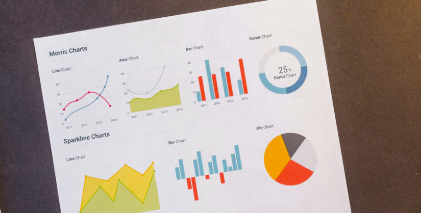
Data Visualisation with MatPlotLib allows Data Scientists to explore and present data. As the old adage goes “A Picture is worth a thousand words”, so too is true for the Data Scientist. In summary, Matplotlib is a comprehensive library for creating static, animated, and interactive visualizations in Python. Basically as the complexity of your data grows, the vast amount of information to be managed becomes untenable. Accordingly visualizations in terms of charts, tables, etc. will help us to understand our data better and even spot trends and patterns.
Data Visualisation with MatPlotLib – Basics
All great journeys begin with the first step. As a result today we are starting with the basics of Data Visualization with MatPlotLib. First, we will go over some of the charts and plots most are familiar with by using only a few lines of Python code. Consequently this should be enough to get most people to start building more elaborate visualizations and explore their data in greater depths.
Before being able to get insightful data visualization, it is important to clean your data and wrangle your data into a usable form. Check out our other articles in our Data Science Basics series. Now that we do have clean data we will be using two main libraries; matplotlib and pandas.
import matplotlib.pyplot as plt
import pandas as pd

Toronto.head()

Scatter Plot
Scatter Plots are very useful if you are interested to visualize relationships between 2 (or at most 3) variables. As a matter of fact based on this plot, you could easily see different relationships ranging from correlation, trends, or even clustering of data points. While the former is interesting if you wanted to find some direct relationship between two variables, the latter helps us tackle classification issues. In order to keep things simple, we will only demonstrate how to make scatter plots for 2 variables.
#Scatter Plot
fig, ax = plt.subplots()
ax.scatter(Toronto.Temperature[0:100], Toronto.Humidity[0:100], marker="o")

#Set labels, titles, and legend
ax.set_xlabel('Temperature')
ax.set_ylabel('Humidity')
ax.set_title("Toronto Temperature vs Humidity Distribution")
plt.show()
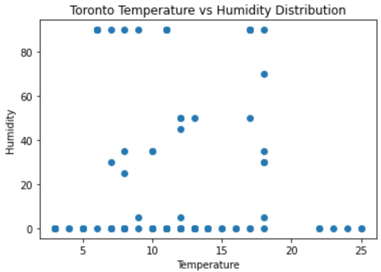
To begin with let us examine each line of code and what is going on.
- First we create a Figure and an Axes to draw our plots using MatPlotLib. For now the most important object here is the Axes.
- Subsequently we create a scatterplot by giving the first 100 data points for temperature and humidity
- The next lines 6-8 are for setting the title, and labels for our axis
- The last line basically says “pleaes plot my chart now”.
And that was it, with a few simple lines of code we were able to generate a scatter plot of our data
Line Charts & Time Series
By and large another commonly used data visualization technique is the line chart. For one thing they are intuitive and allows one to compare the relationship between two variables. Most often times one of these variables is a continuous value such as time. As an illustration we show how we can make a simple plot about temperature and humidty. We take 24 hours of a random day in Toronto in order to understand how these change.
#Line Plot & Dates
fig, ax = plt.subplots()

#Add first line
ax.plot(Toronto.Temperature[0:24], label='Temperature')

#Add second line
ax.plot(Toronto.Humidity[0:24], label='Humidity')

#Set labels, titles, and legend
ax.set_xlabel("Date/Time")
ax.set_ylabel("Temperature C / Humidity %")
ax.set_title("Toronto Temperature change over time")
ax.legend()
plt.show()
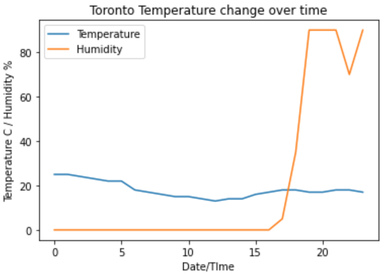
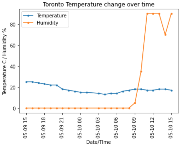
At this point, even though we have managed to make our line chart, something is dissatisfying. Rather than displaying numbers on our x-axis, wouldn’t it be better if those were replaced by time. In order to do so we slightly adjust the code we issue.
#Line Plot & Dates
fig, ax = plt.subplots()

#Add first line
ax.plot_date(Toronto.Date[0:24],Toronto.Temperature[0:24],label='Temperature', linestyle='-', marker='.')

#Add second line
ax.plot_date(Toronto.Date[0:24],Toronto.Humidity[0:24],label='Humidity', linestyle='-', marker='.')

#Set labels, titles, and legend
plt.xticks(rotation=90)
ax.set_xlabel("Date/TIme")
ax.set_ylabel("Temperature C / Humidity %")
ax.set_title("Toronto Temperature change over time")
ax.legend()
plt.show(
Instead of using the plot function, we instead use plot_date. By looking closely at the code you may notice this addresses our issue. With the additonal command of xticks, we rotate our x-axis label by 90 degrees for easier readability.
Histogram
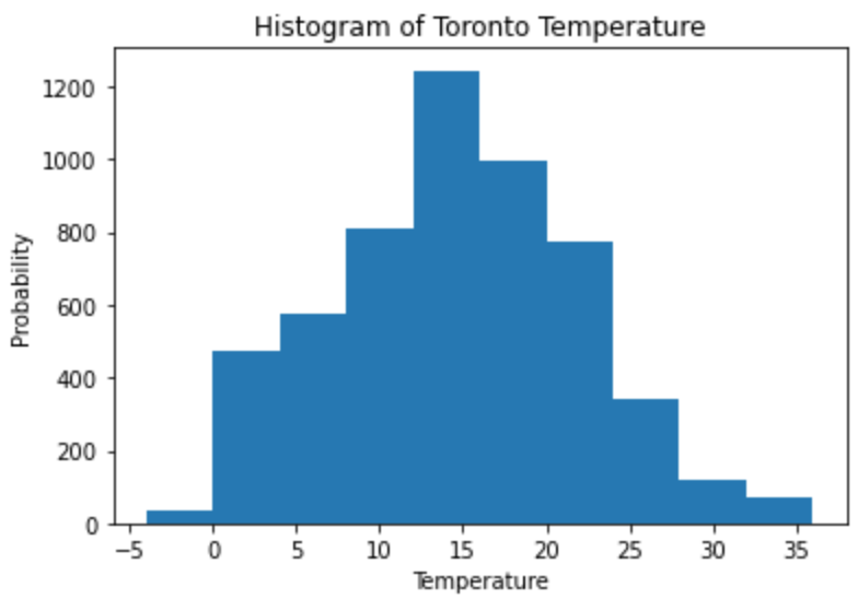
Histograms allow us to see the distribution of our data over a set range. Often times after binning of values within a certain range we can see amongst the population of our data the probability of a value falling into a certain bin. Furthermore this is a common technique in statistics to understand whether the data points we have collected fall under a normal distribution. If you have not already, we recommend checking out posts on how to bin numerical data in our Data Wrangling series. At the present time we take our temperature data and attempt to plot a histogram.
#Histogram
number_of_bins=10
fig, ax = plt.subplots()

#Add our data based on the bins
ax.hist(Toronto.Temperature, number_of_bins)

#Set labels, titles, and legend
ax.set_xlabel("Temperature")
ax.set_ylabel("Probability")
ax.set_title("Histogram of Toronto Temperature")
plt.show()
Pie Chart
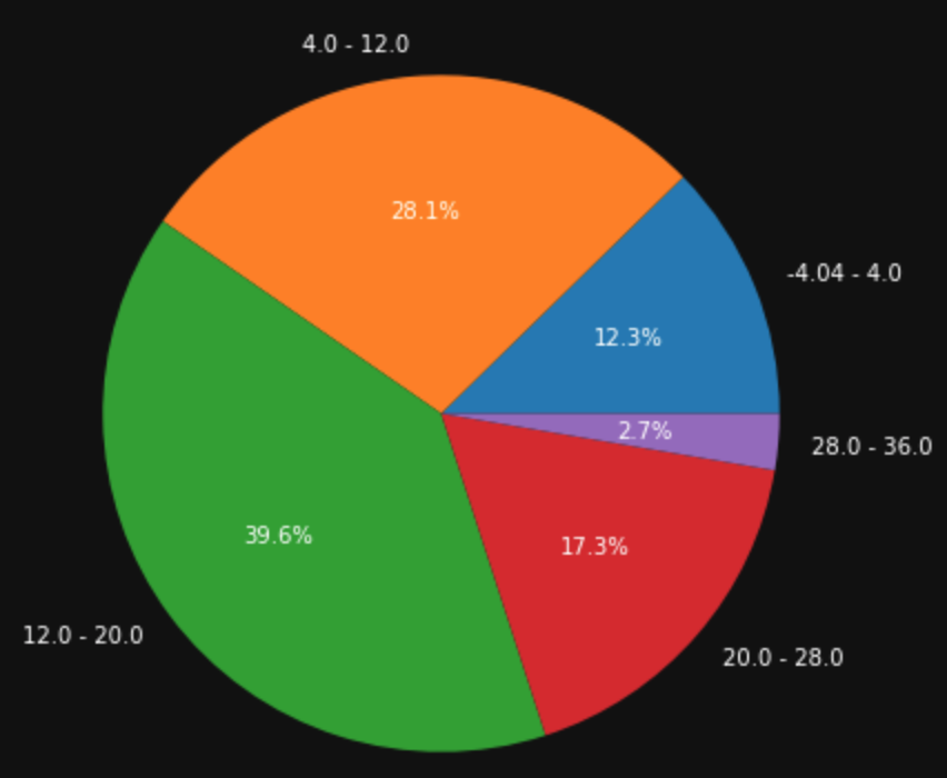
Compared to histograms or scatter plots, in order to create a pie chart, a few more lines of code are needed. That is because we need to process our data and bin them according to the number of slices we need. Furthermore depending on the number of bins we need to calculate the percentages of each slice. Based on lines 57 to 66, we perform our data wrangling. Once we wrangled our data, the actual plotting of the pie chart is very similar to what we have seen before.
#Pie Chart
number_of_bins=5
temp_cut, temp_bin = pd.cut(Toronto.Temperature, bins=number_of_bins, retbins=True, labels=False)

temp_count=[]
labels=[]
for i in range(0,number_of_bins,1):
    #Divid the count of each item by the total number of items - Then add to a list
    temp_count.append(list(temp_cut).count(i)/temp_cut.shape[0])
    labels.append(str(temp_bin[i])+" - "+str(temp_bin[i+1]))

#Create our pie chart with our wrangled data
fig, ax = plt.subplots(figsize=(7, 7), subplot_kw=dict(aspect="equal"))
ax.pie(temp_count, autopct='%1.1f%%', labels=labels, textprops=dict(color="w"))
plt.show()
Box Plot
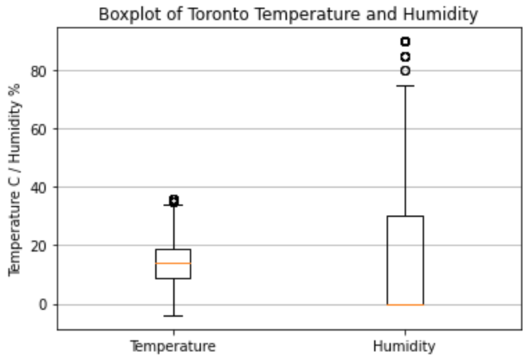
In one of our earlier posts we discussed about using Pandas describe function to understand the distribution of our data. Comparatively we can do something similar but instead with data visualizations. By using box plots, we get similar information such as mean, distributions and min & max information.
#Box Plots
fig, ax = plt.subplots()
ax.boxplot([Toronto.Temperature,Toronto.Humidity], labels=['Temperature','Humidity'])
ax.set_ylabel("Temperature C / Humidity %")
ax.set_title("Boxplot of Toronto Temperature and Humidity")
ax.yaxis.grid(True)
plt.show()
Multipe Charts in a plot
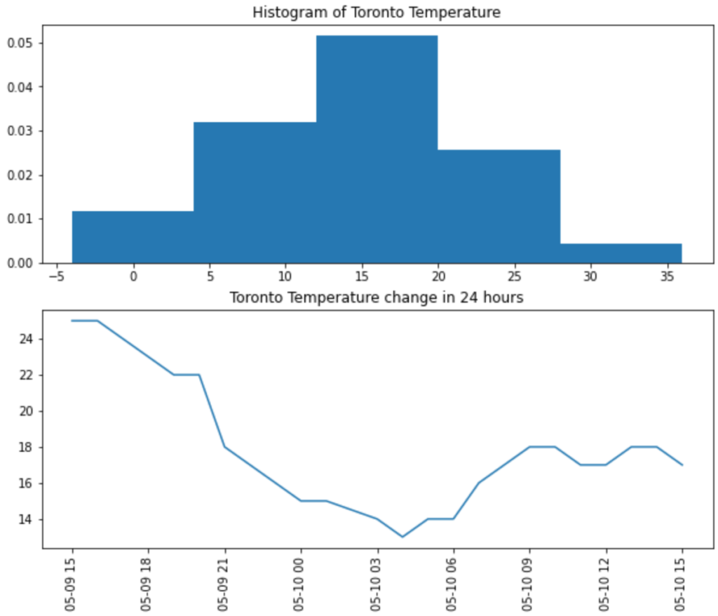
As has been noted the matplotlib library is very powerful and allows us to plot many different charts. Given that, the last tip and trick I would like to briefly look at is how do we plot multiple charts in a plot. This can be achieved with a slight modification of our previous commands. When you look closely at the code shown below, this is solely dependent on the plt.subplots() command we issued. By providing more details about how many charts we want we can easily create multiple charts.
#Multiple Charts in a plot
#The parameter nrows=2 allows us to plot 2 charts on top of each other
fig, ax = plt.subplots(nrows=2, figsize=(10,8))
ax[0].hist(Toronto.Temperature, number_of_bins, density=True)
ax[0].set_title("Histogram of Toronto Temperature")
ax[1].plot(Toronto.Date[0:24],Toronto.Temperature[0:24],label='Temperature')
ax[1].set_title("Toronto Temperature change in 24 hours")
plt.xticks(rotation=90)
plt.show()
Summary – Data Visualisation with MatPlotLib
Another important tool in the Data Scientist’s toolkit is the ability to visualize data. Not only will it allow us to better explore and understand our data but also to identify and patterns or trends we may not easily spot. Additionally using visualizations allow us to communicate results of our analysis and will become invaluable later on. Given these points leave us a comment if you have found this useful or there are further techniques or plots you would like to know about.

